MILESTONE 1
For my portal, I started by some rough sketches of what I wanted my site to look like. I wanted to try a design that stood out from my normal portfolio and other sites I've made.
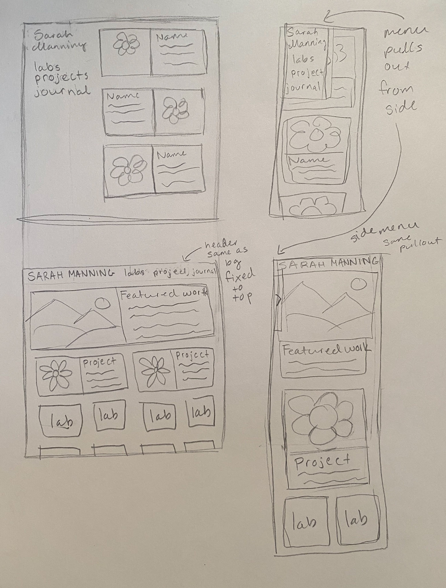
I decided to go more with the second type design, with a fixed nav at the top that collapses down on mobile. I wanted to make a section for a "featured" work, but that may not be implemented until I have a work good enough to feature.
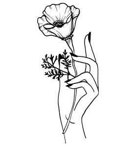
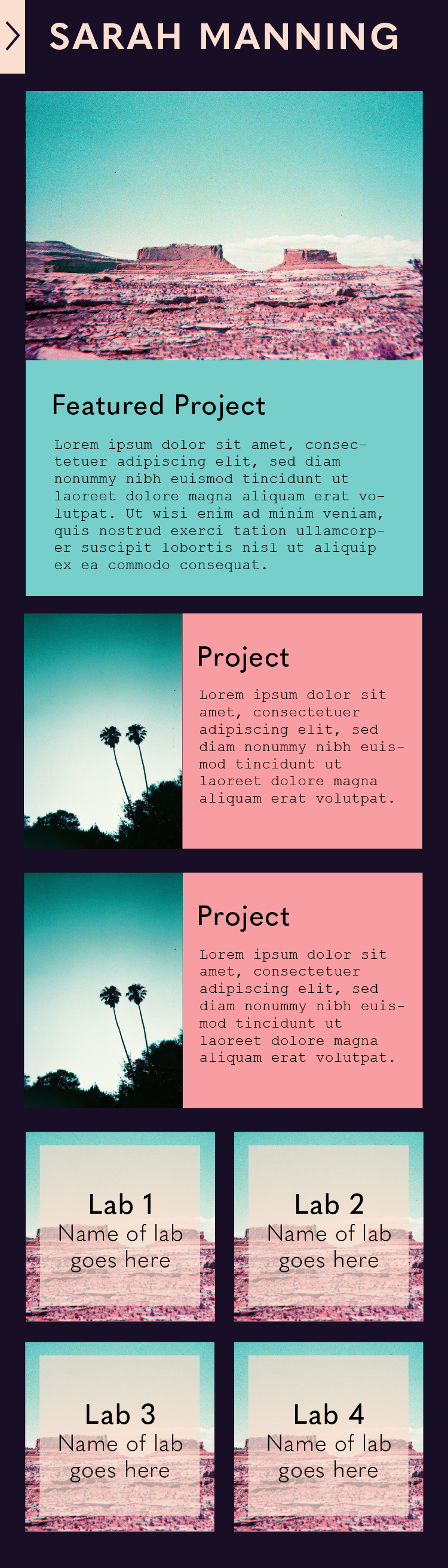
I created some mock-ups of the site on web and mobile using Illustrator. For the color scheme, I knew I wanted a dark theme going in. I ended up picking all the colors from my first "filler" photo (just a placeholder for now). The picture is film photo I took on special purple lomochrome film, and I'm obsessed with the colors.

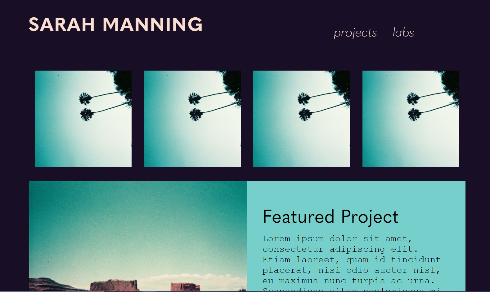
Browser/computer view of the website. The labs at the bottom will display the text overlay when hovered, as shown by the one in the middle. The header up top has the same color as the site background underneath, but when scrolling it will be fixed so that the user doesn't have to scroll back to the top.
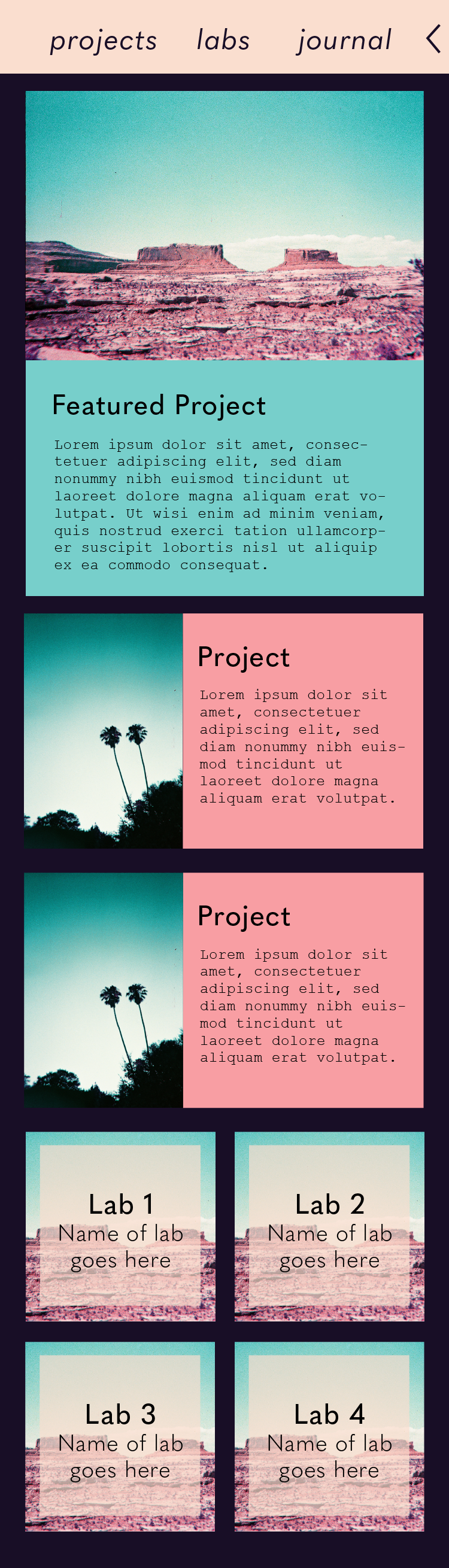
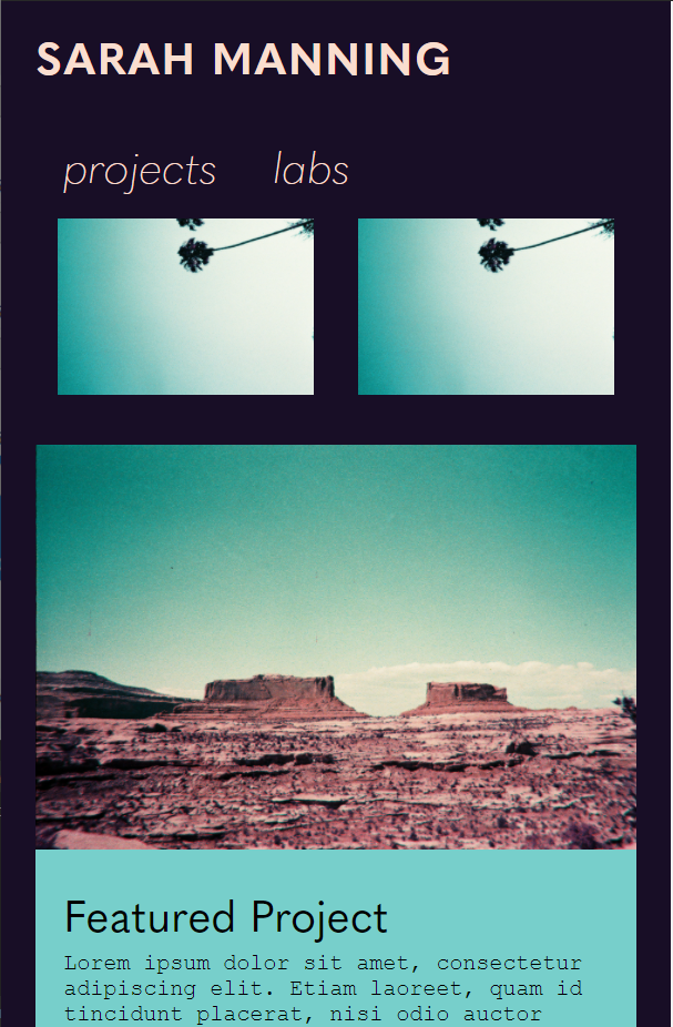
Mobile view of the website. The header will still be fixed, but the site navigation options are now going to be a pull-out that will wipe over my name in the header, instead of a side bar. The labs will no longer have hover text, instead they will have mildy transparent overlays. Hovers are hard to use on mobile so I am trying to move away from those.
This website will be one page. The links in the navigation will just link to section IDs to jump the scrolling of the page to the appropriate section.
Each "card" for the labs or projects will respond when hovered/interacted with. I'm not sure what effect I want them to have, but it will probably be some kind of enlarging or drop shadow animation, to give the page some life. When clicked, the cards will link to the appropriate lab or project page.
MILESTONE 2
To build the site, I used a custom "boiler plate" HTML template that I created last year in David Schaal's Creative Web Dev class. This just set me up with Tailwind, a CSS framework, and Gulp, which processes my CSS and build and runs a browser synced server for working. It also includes an animate on scroll library.
I heavily edited my Tailwind configuration file, which basically customizes the utility classes that tailwind designs and gulp will build for me. I changed the color palette and fonts to match the ones from my site design. I love using Tailwind because it allows me to quickly configure utility classes, and then be able to customize and control every aspect of CSS on an element directly in the HTML. Tailwind classes can also all be customized to change and react with browser width, making it easy to make my site responsive to mobile.
The nav isn't exactly what I had imagined it to be, I'm not sure what type of JavaScript I want to use to make it work yet (I might use j Query) and I didn't want to half-ass one. For now, the the elements just wrap underneath my name, which shrinks to fit on one line.
I added box shadows on hover to the elements, but they don't show up very well because the background is dark. I may need to consider a new animation for those. I also still have placeholder text spots, just because I wanted to show what those would look like but didn't have any content for them yet. Once I have projects, that section will be above the labs.
Overall, I think my site turned out really well compared to what I had imagined.